Bright, bold and playful - bringing joy back into sustainable mobility
Loud Mobility was founded with the goal of stimulating the system-change needed to achieve the broad reaching benefits of sustainable mobility.
By working on high impact and cross-sector projects, they are able to widen participation in sustainable transport and mobility, focusing on delivering benefits for people, planet, places, and play.
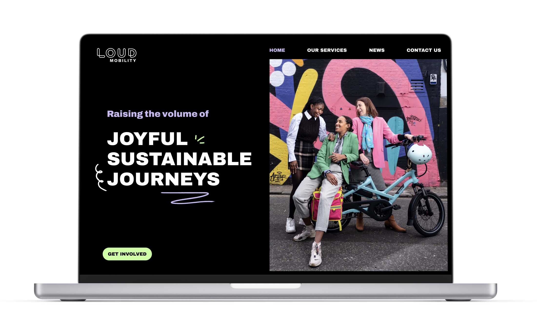
We worked with Loud Mobility to build them new brand, building on existing foundations. The brand was then translated into web pages, with the goal of capturing excitement from their growing campaigns, and professionalising for their fast-approaching growth.


A balance of high contrast elements with humanistic features
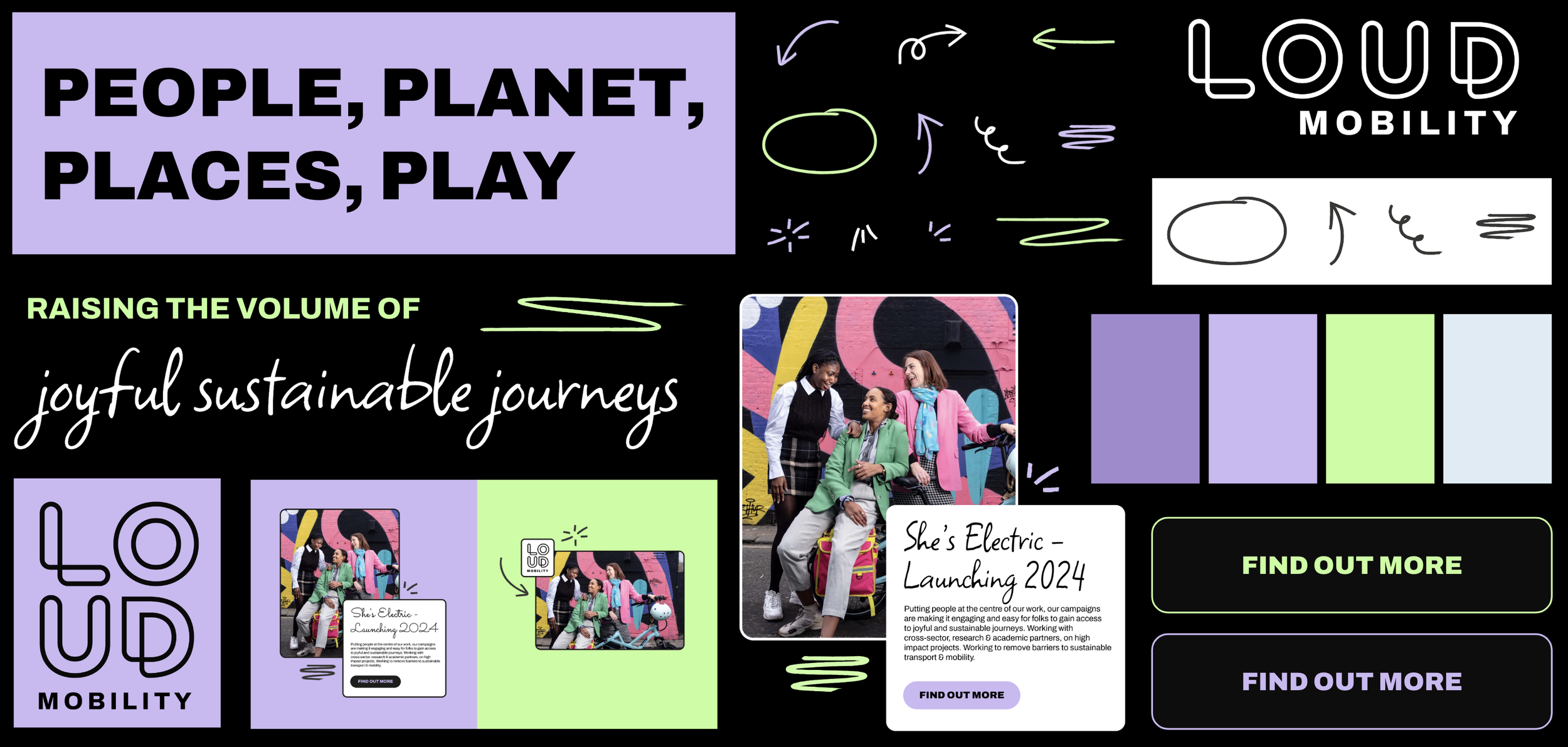
As a brand, Loud Mobility are taking ownership and creating a more positive impression of loudness, by focusing on empowerment and joy. Accessibility and inclusivity is also a very important part of what they do, so we kept this in mind when building out their rebrand.
Working from the existing brand bones, we proposed a simpler, alternative logo layout and an expanded colour palette, to includes more user-friendly shades without losing their impact.
The colours are bright and encouraging - paired with pure white and black, they allow for eye-catching designs and high contrast visuals, which worked well with Loud’s narrative and values.
The typography followed a similar pattern, combining ultra-bold headings with a softer, humanistic script. The extreme contrast also allows for a stronger and more accessible hierarchy.


Hand-drawn visuals of sound and movement
To add more character and energy to the brand, we created a set of visual expressions, also continuing the human feel. The marker texture feels bold and strong, allowing them to pop on screen regardless of the background colour.
Placed next to imagery or text, they create powerful assets that can standalone, or as part of a collective. The content bounces off the page, whilst delivering all of the information effectively.
We then crafted a few key pages of their website, focusing again on delivery of information and generation of energy and excitement. The site utilises the colours as differentiators between their different service offerings, with the visual expressions and bold typography adding pops of personality throughout.
Check out the work in progress here!


