

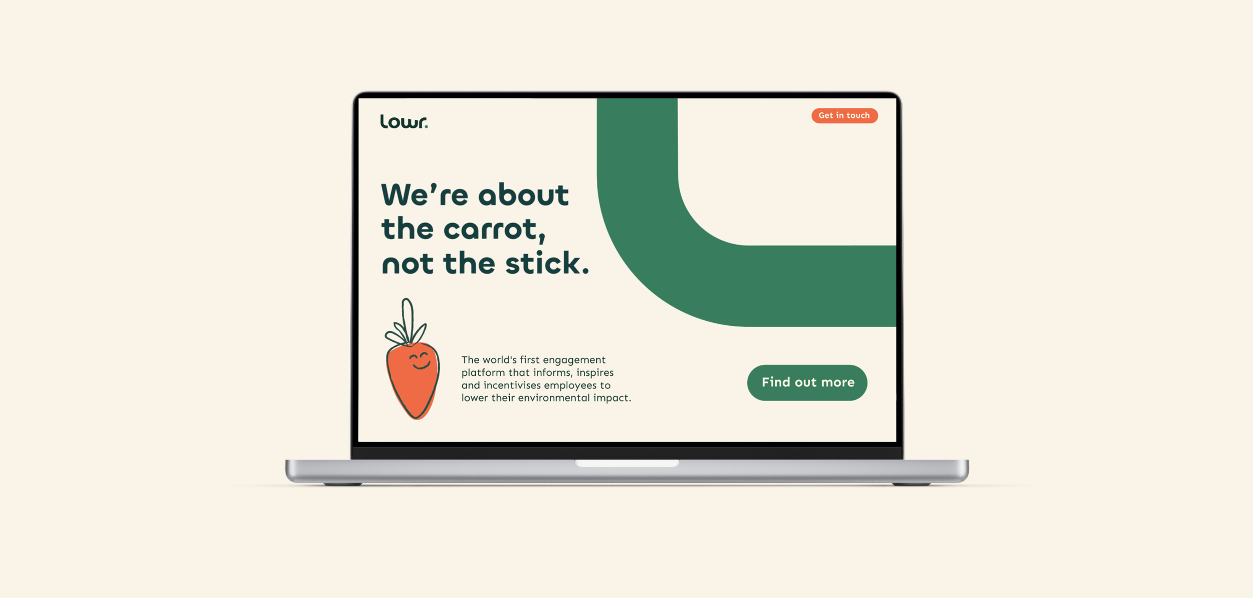
Real user rewards for greener choices
Lowr are the proud creators behind the world’s first AI-powered sustainability platform for organisations to log and lower their users emissions.
Lowr believes in real rewards, and that sustainability can be embedded into fan communities. With their platform, they encourage users to lower their carbon footprints, providing real rewards for doing so.
As a female-founded business, we were asked to build a new brand that was strong and to-the-point, much like themselves.

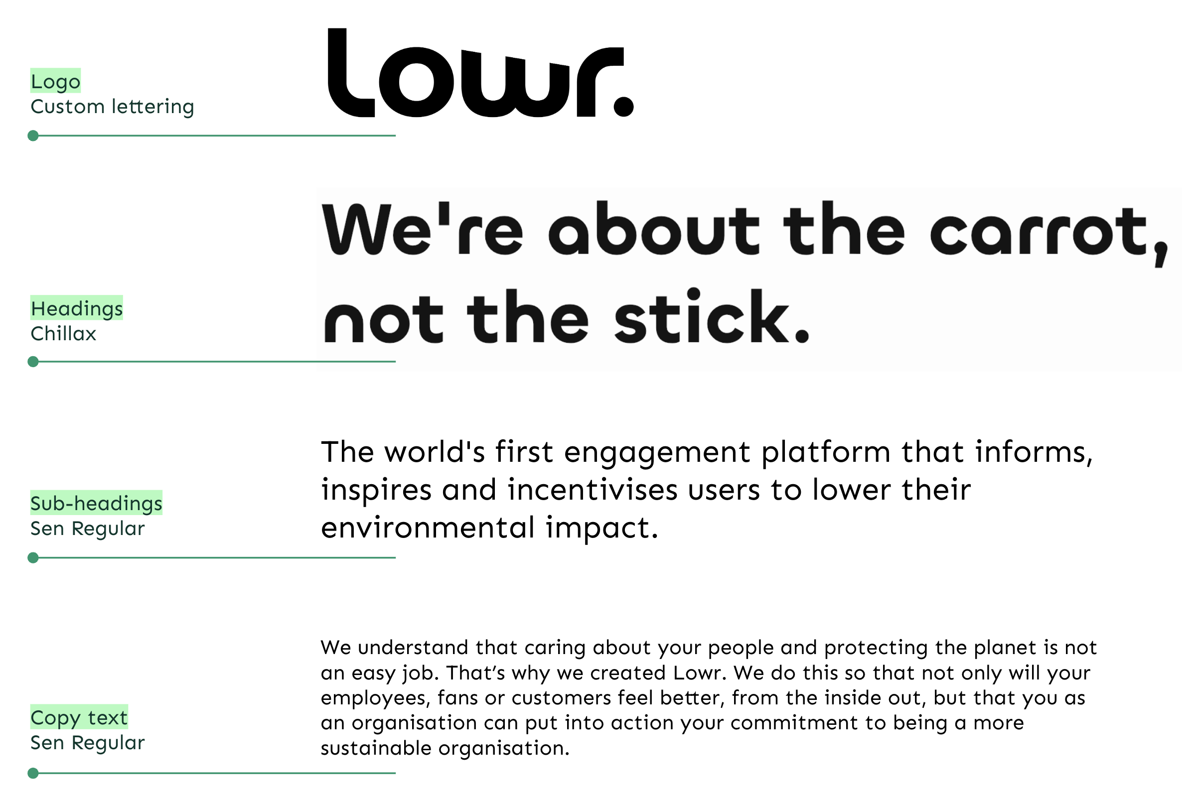

Ultra-fluid typography and pops of colour
We went with a bold, ultra-fluid typographic style, and delicately altered the letterforms to include subtle downwards angles. This allowed the logo to encompass both early references to the Lowr mission (without feeling negative) and a sense of movement and progression.
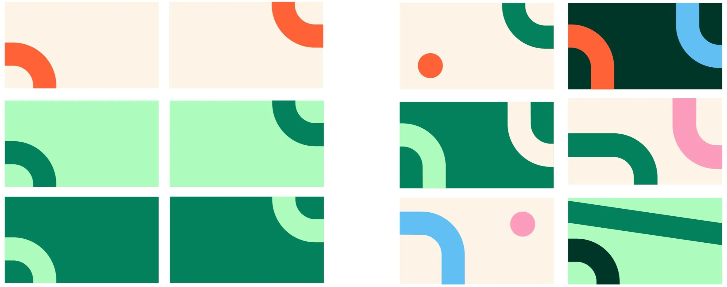
The angles were then extracted to form a set of eye-catching shapes. Paired with a bright and bold colour palette rooted in fresh green shades, the assets made up interesting and distinct backgrounds for the Lowr brand to sit in.


A recognisable brand for a powerful team
The bright colours and fluid lines pop on screen, which works perfectly for Lowrs digital experience. The assets work simply together, building and delivering the impact that Lowr is striving for, both in brand and mission.
