

Redefining decarbonisation with nanoalloys
By harnessing the power of nanoalloys, Milvus are spearheading the transition to a cleaner and more sustainable energy landscape.
Their catalysts offer a cost-effective and abundant alternative to metals like platinum, iridium, and cobalt. Not only are our solutions more affordable, but they also alleviate the environmental and human rights concerns associated with traditional mining practices.
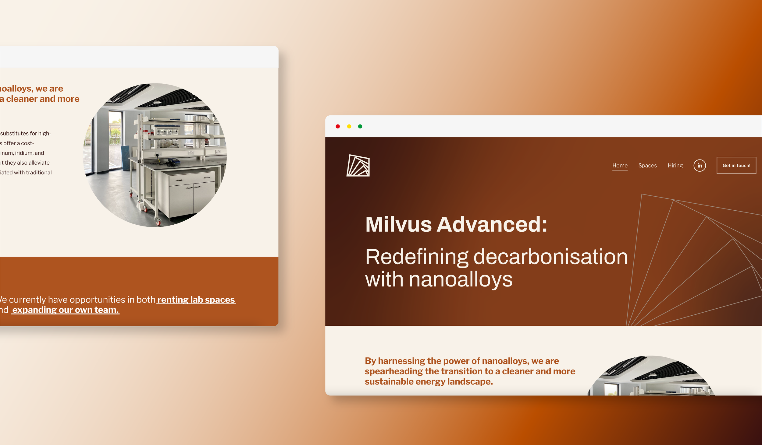
We worked with Milvus to craft them a durable brand that was representative of their fundamental values and day-to-day experience. We then translated this into a dynamic and informative website, to aid the team in hiring key players and selling workspaces in their new lab.


Capturing the unexpected beauty within Milvus’ work
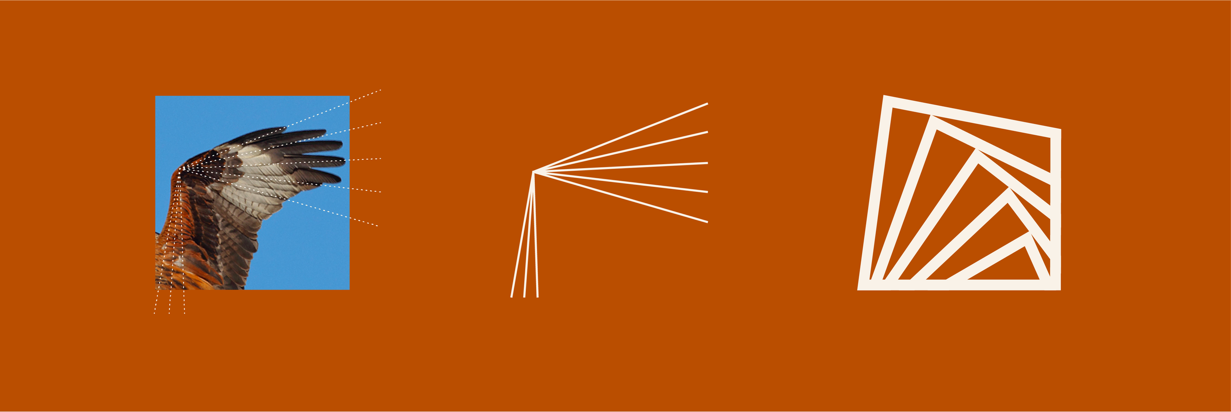
Milvus is the latin word for ‘red kite’, and had a particularly strong meaning for the founder. This became embedded in the brand in various ways, whilst staying relevant and professional.
The logo was inspired by the wing of the bird, with the multiple ‘feathers’ also capturing a sense of transition and movement, which fit in nicely with the narrative. Paired with simple, accessible typography, the icon feels recognisable and clear.
The colours were another strong reference to the bird, as well as reflecting the colours of the materials used in their lab work. The metallic shades feel strong and rustic, so we used gradients to add a bit of softness and a touch of modernness in their application.


Redefining decarbonisation with nanoalloys
When approaching the site, we spent time establishing the key goals and their corresponding CTA’s. Finally emerging from ‘stealth mode’, Milvus wanted to enter the public eye with a bang, and achieve a sense of professionalism straight away.
The colours worked brilliantly to separate page content, and create a long lasting impression of the brand and site. We visited their lab space to take photos for them, and then used these throughout the site to provide context on their workspace.
With the clean typography doing it’s job, we balanced the pages to keep the user journey feeling easy and engaging, whilst capturing the brilliance that made up the business.
Check out the site here.


