Raze : The Good Rewards Community.
The advertising system is broken. But Raze is helping people take back control and influence the world around them with brands that they truly believe in.
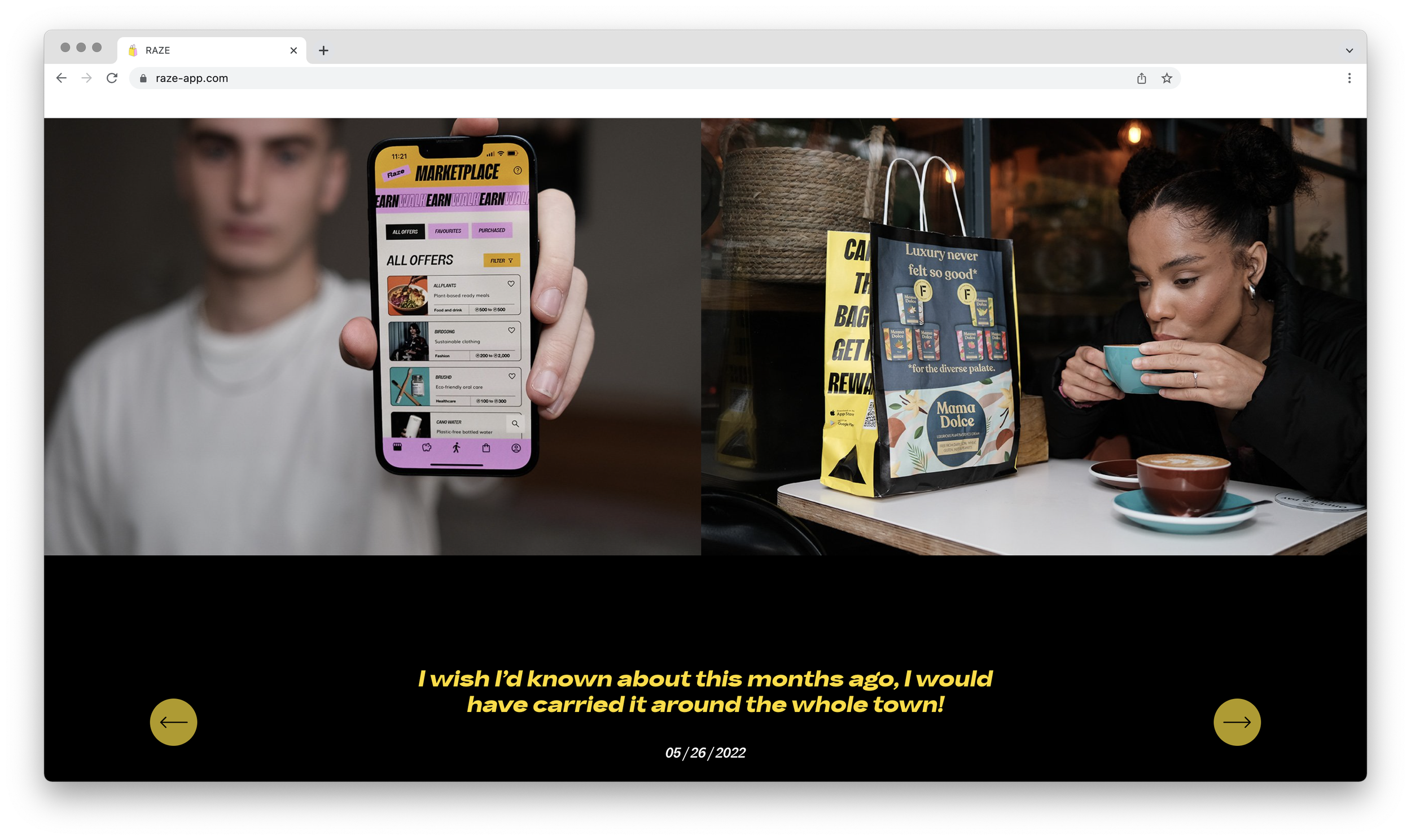
Raze is introducing a new take on advertising. By carrying one of their paper bags, you can earn and spend on sustainable brands, all whilst promoting purpose-driven brands to the people around you.
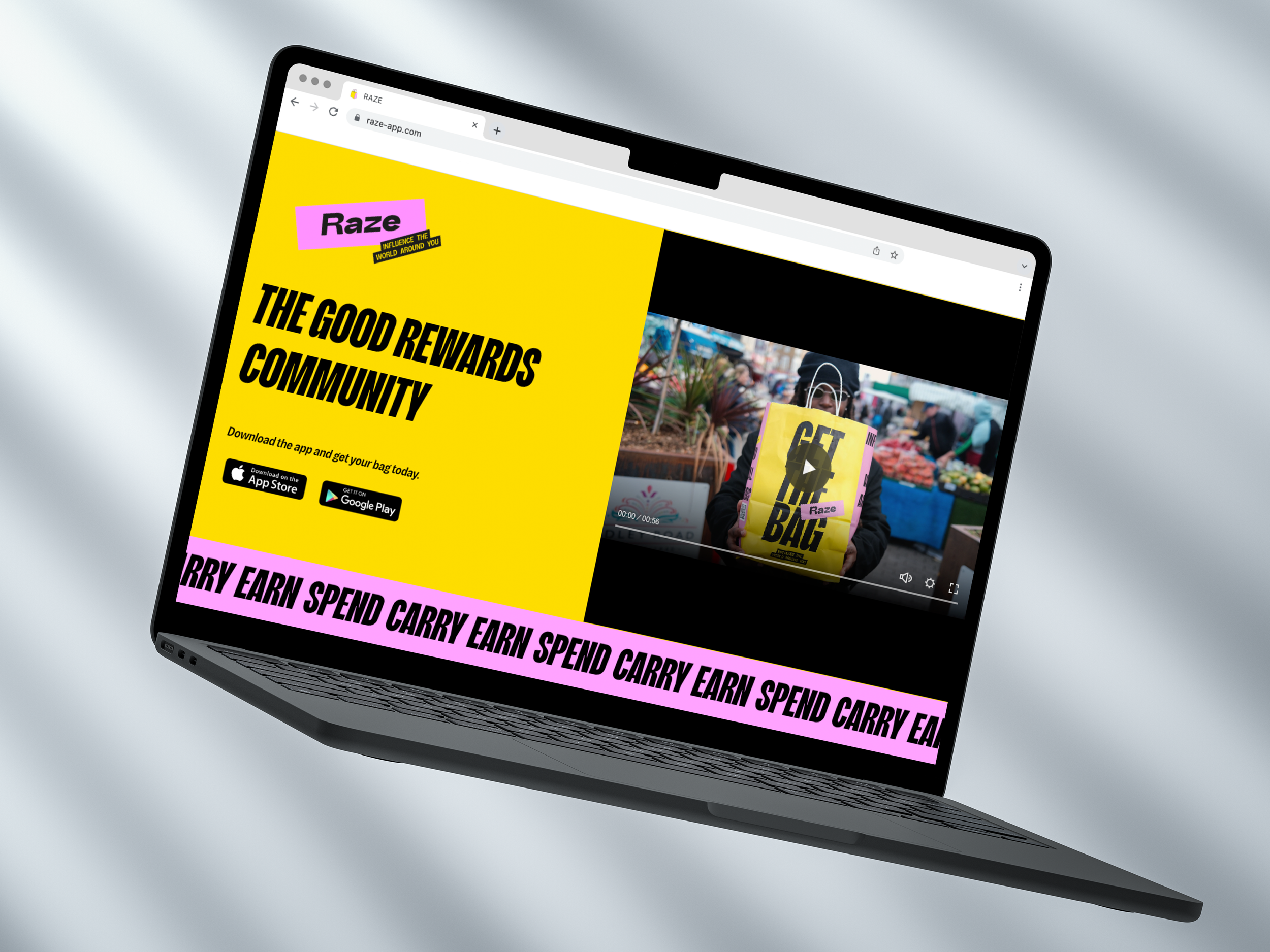
They asked us to support them with building a new eye-catching website to follow their recent re-brand, and encourage new users to download their app.


An eye-catching new website to engage new users.
Raze’s new brand is eye-catching and modern, with their tone of voice taking more of an empowering angle. We wanted to make sure that their website captured the excitement of the new brand, whilst still focusing on encouraging people to download the app.
Making use of their bright colour palette and custom typefaces, we used panels of moving text with their key slogan to play up the modern feel, and build recognisability with their messaging.
As the end goal of the site is the encourage app downloads, we kept content to only the key information, focusing on creating a consistent and engaging user journey. We reinforced direct CTA’s throughout the site, and used distinct panelling throughout the site to keep all content accessible and not overwhelming.
Download the app today and start earning!


