

A colourful, engaging identity for a brand building new connections
Root are making shareholder democracy easy for all stakeholders with their new platform.
By connecting their portfolios, everyday investors are given the change to engage with campaigns and support topics that they believe in.
We worked with Root to build them a balanced brand that would connect with experienced investors, whilst inspiring and encouraging a new generation of investors.


Clarity and accessibility - a unique brand built for connectivity
The Root logo is simple but recognizable, with a clear visualisation of flourishing and growth. The soft curves create a friendly feel, whilst retaining accessible and clear.
We chose colour palette that was bright, refreshing, and bold, evoking feelings of inspiration and encouragement.
For typography, accessibility was key. The typefaces chosen are clear, strong and open, allowing text content to be digestible and eye-catching.


Playful visualisations of flourishing and growth
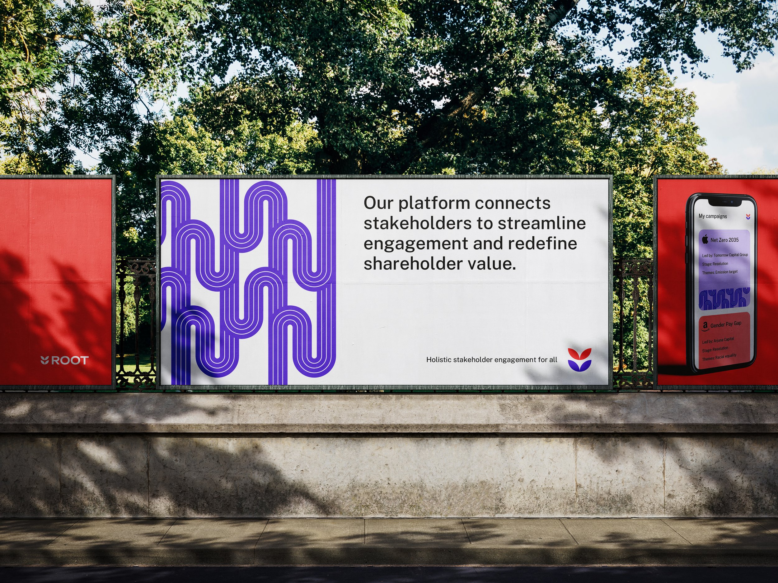
To continue the visual theme of growth and flourishing, we crafted some pattern assets based around route making and connectivity.
Fluid and modern, the shapes build on each other, much like a tree and it’s roots. Deployed in select colours, the bring the space to life with a splash of colour.
